The Apartments.com Design System
When I joined the Apartments.com team, there was a great need for consistency for the UX and dev teams. There was no shared library of assets and most designers were copy and pasting out of existing Sketch files. There was a ton of redundancy throughout the site and it resulted in long load times, slow processes, disagreements on what patterns to use, and tons of wasted effort by both teams.
The Mortar Manifesto:
Mortar is a substance used to hold bricks together. Under-appreciated, but essential to building any structure, usually the bricks steal the show. No one looks at a brick house and says “wow, look at that mortar!” (unless they’re a particularly nerdy mason). We usually appreciate a house for the sum of its parts rather than the individual pieces that bring it together.
Your typical mortar is made of lime, cement, sand & water. Our Mortar is made of clever design thinking, human-focused solutions, rich data, and enough coffee to kill a horse.
In this way, Mortar is the perfect name for the Apartments.com design system. Mortar is what binds our design philosophy, our fundamental components, and our vision together to create a website that is beautiful, functional and intuitive. Our goal is making the process of renting or leasing a home easier for everyone, be they renter or property manager.
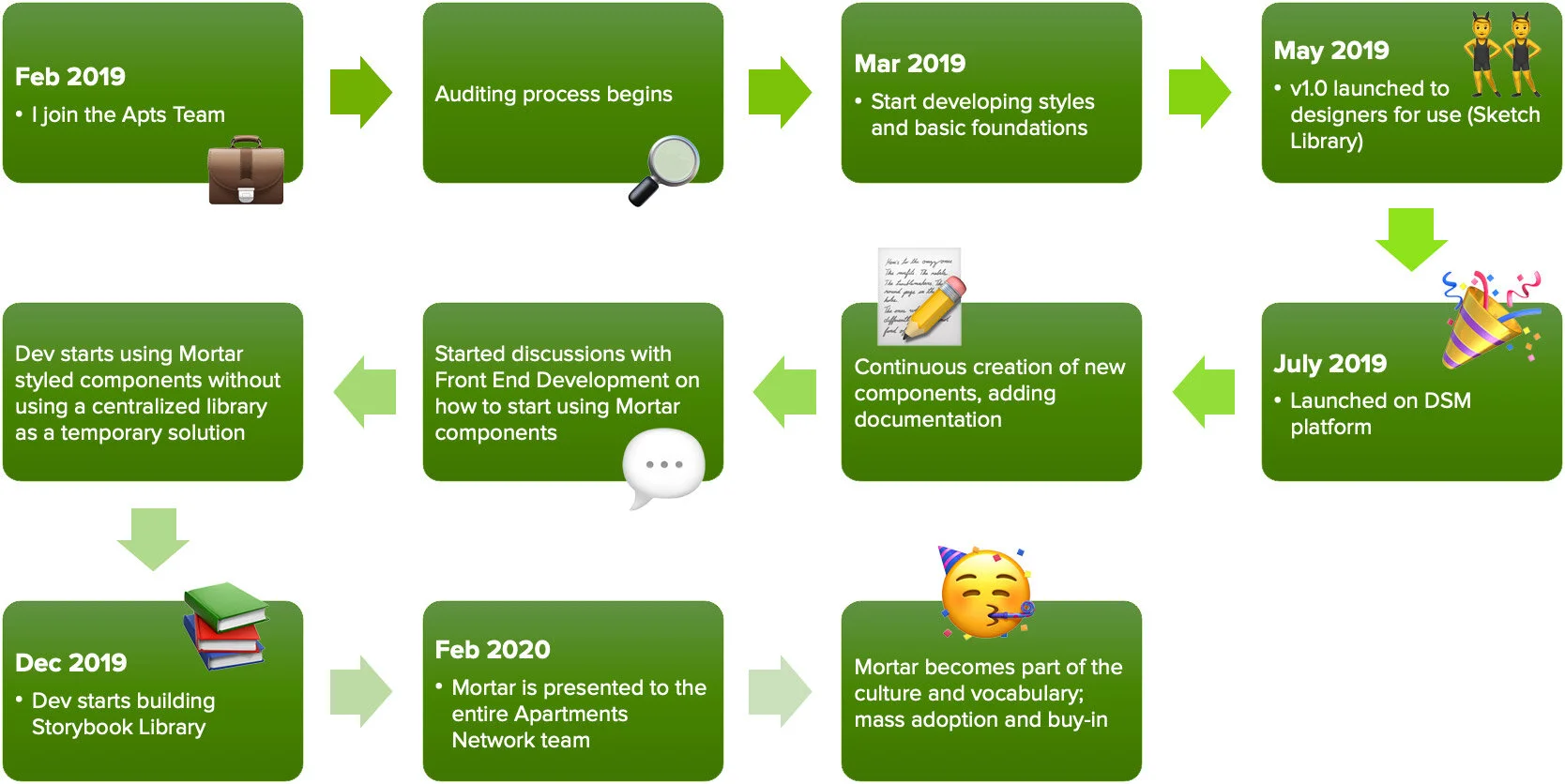
It took 4 months of dedicated effort to get Phase 1 of the Mortar Library launched to the design team. By 1 year, we launched Mortar 1.0 to production.
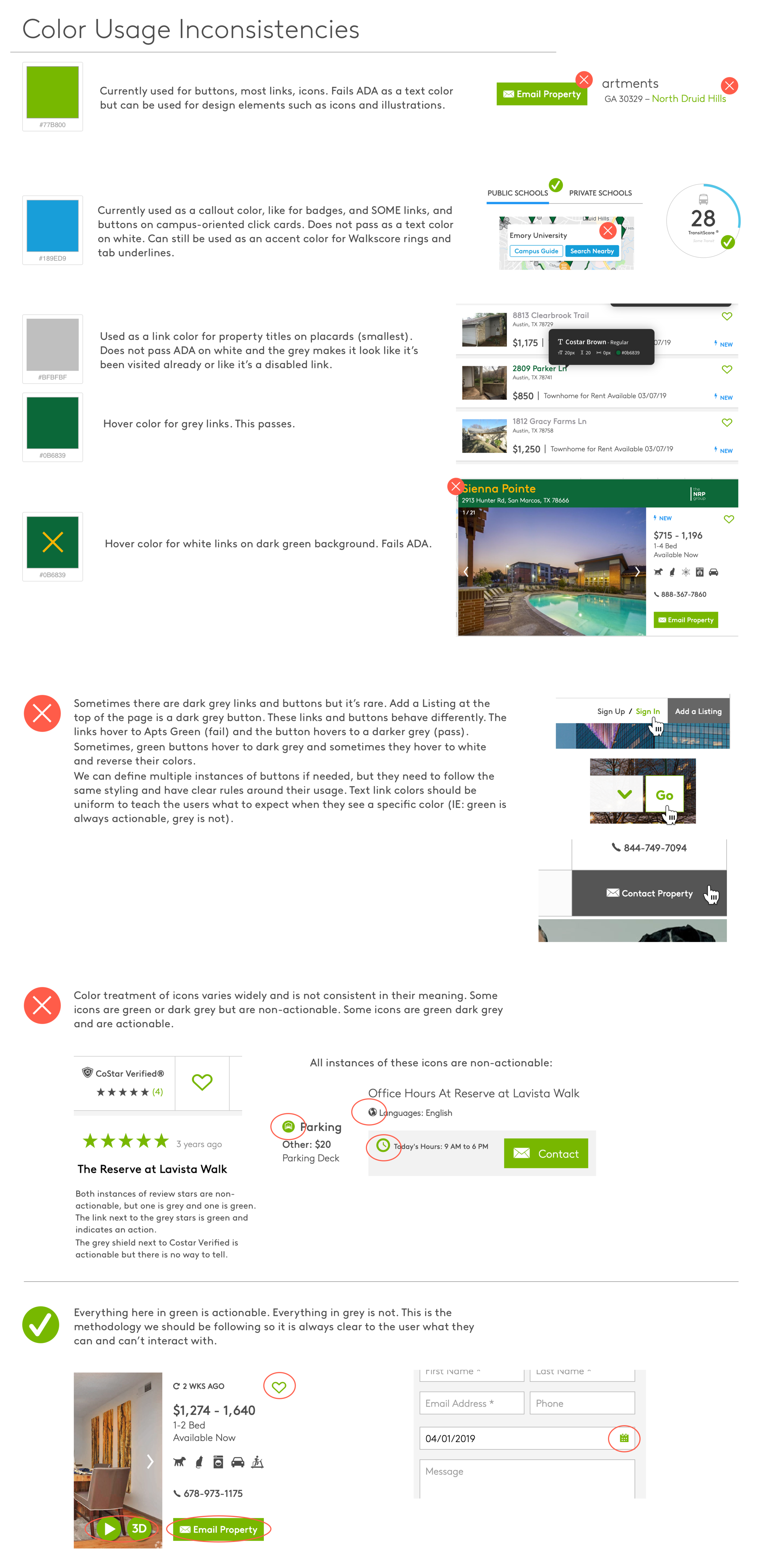
During my audit of how Apartments.com was using color, I found a ton of inconsistencies that were likely causing confusion for the user. Styling for buttons and links felt random, and what was actionable at a glance was never clear. My challenge was to develop rules around color to make it clear to the user what colors meant and how it impacted the interactions on the site.
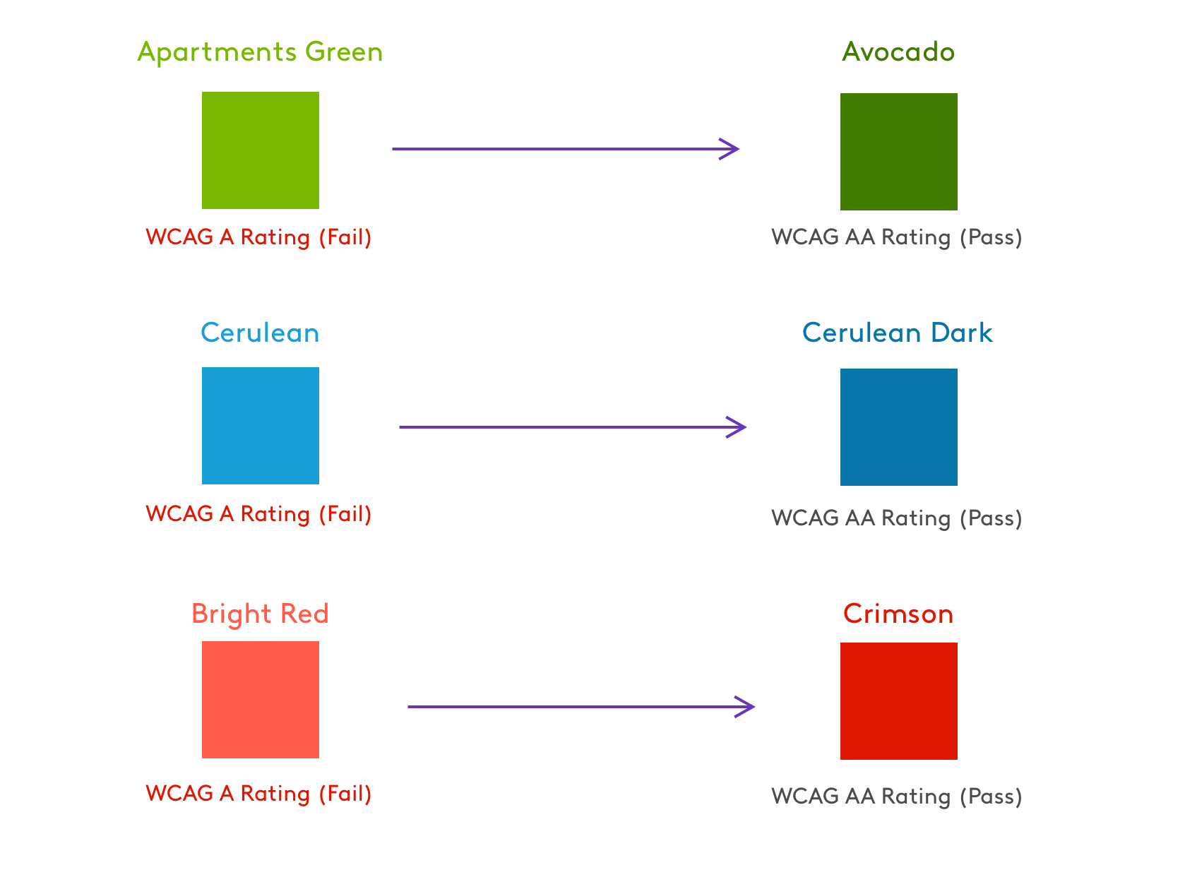
In addition, I discovered that the two colors we were using most often, Apartments Green and Cerulean, failed WCAG3 contrast standards.
Color Usage Audit
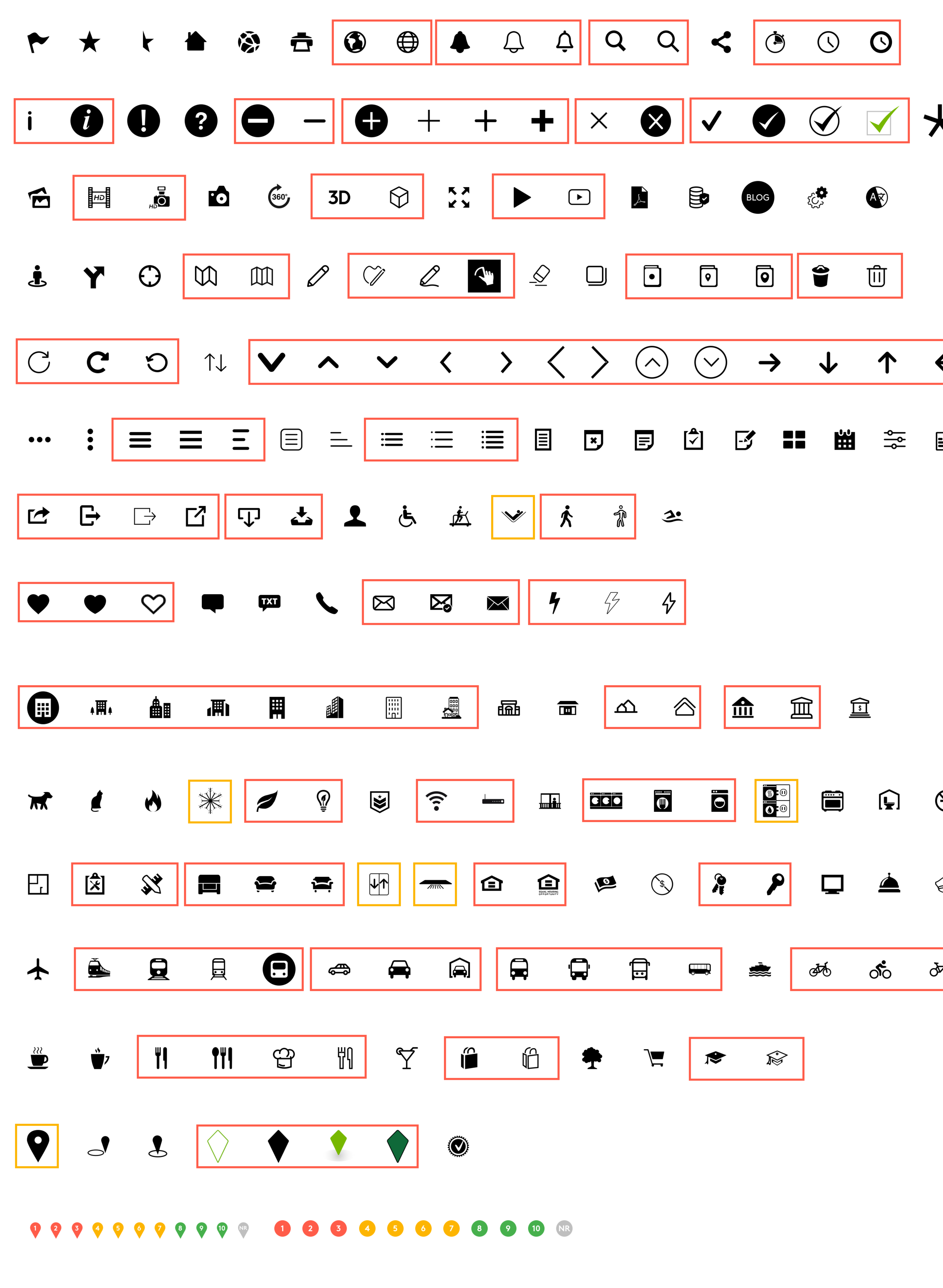
The audit is essential to understanding what you already have and where you can cut out the fat. Icons, color usage, text sizes and styles, buttons, form elements, animations, headers, footers, menus — no stone was left unturned. The image on the left was part of the icon audit, and items outlined in red were redundancies so we could easily see where we were repeating ourselves.
The Audit
Color & ADA Compliance
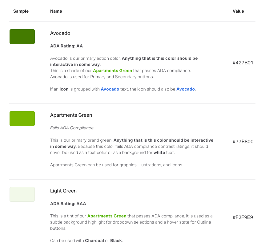
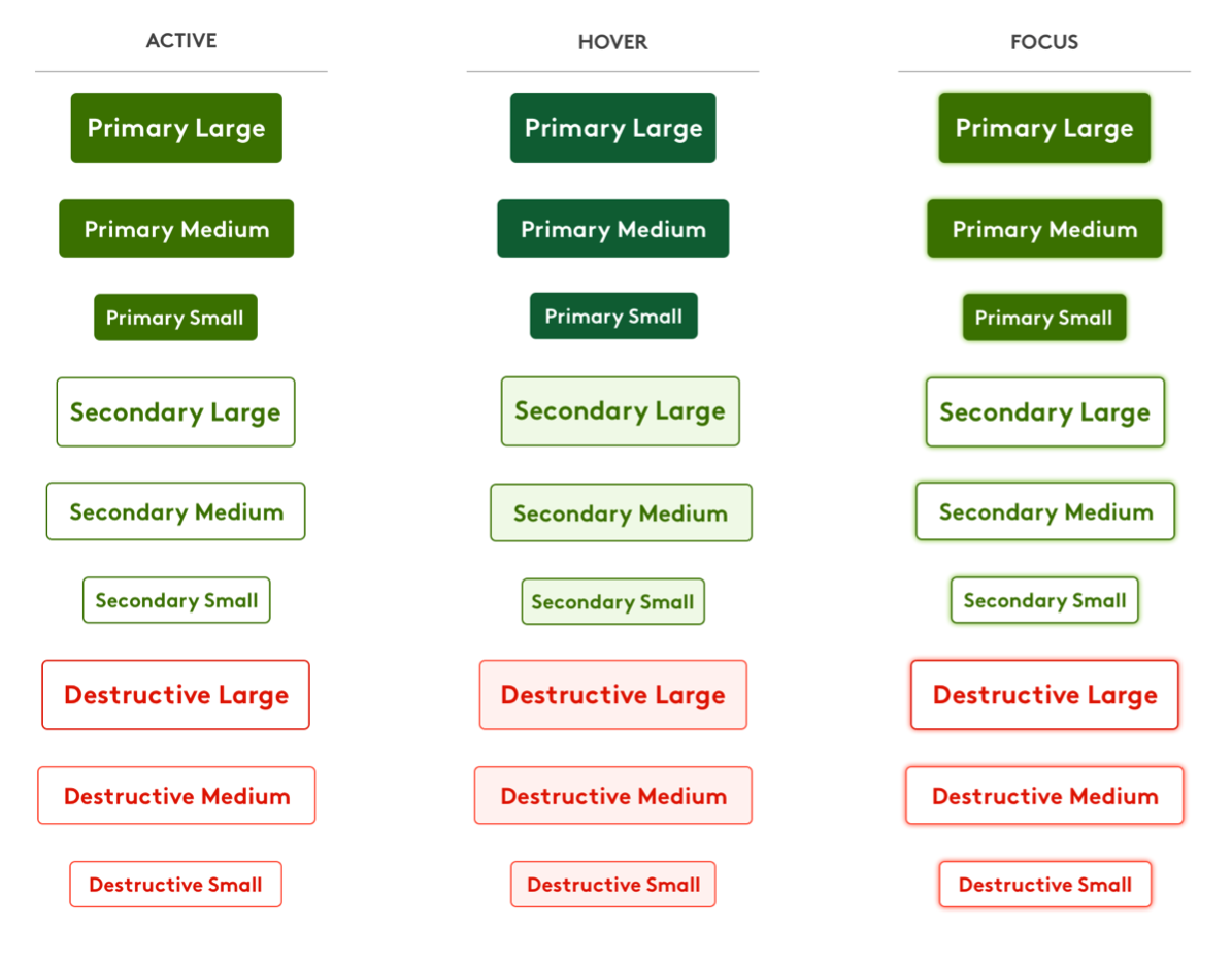
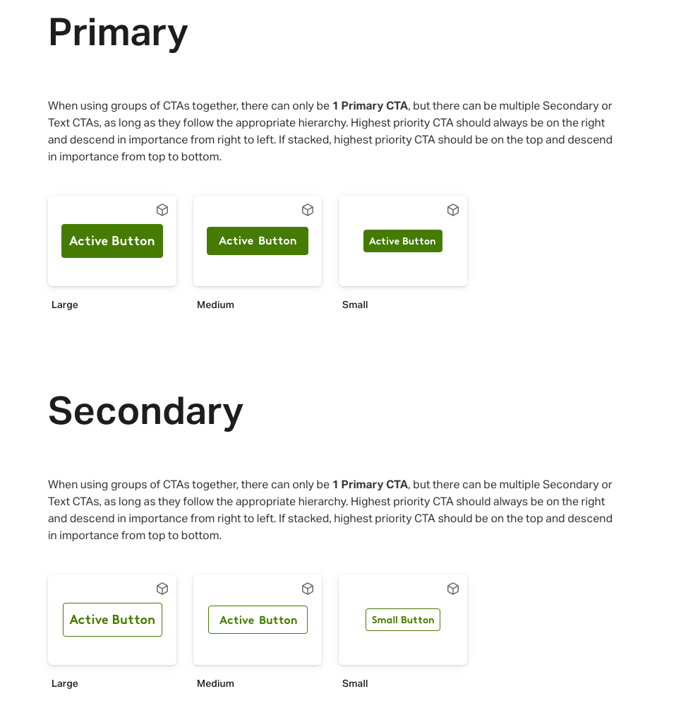
Color usage became a point of contention, as the standard “Apartments Green” and “Cerulean” failed to meet WCAG3 contrast accessibility standards, so we had to sell the concept of darkening the primary colors on the sight to increase usability for users with vision impairments.
Finalized UX Color Palette
Form Fields
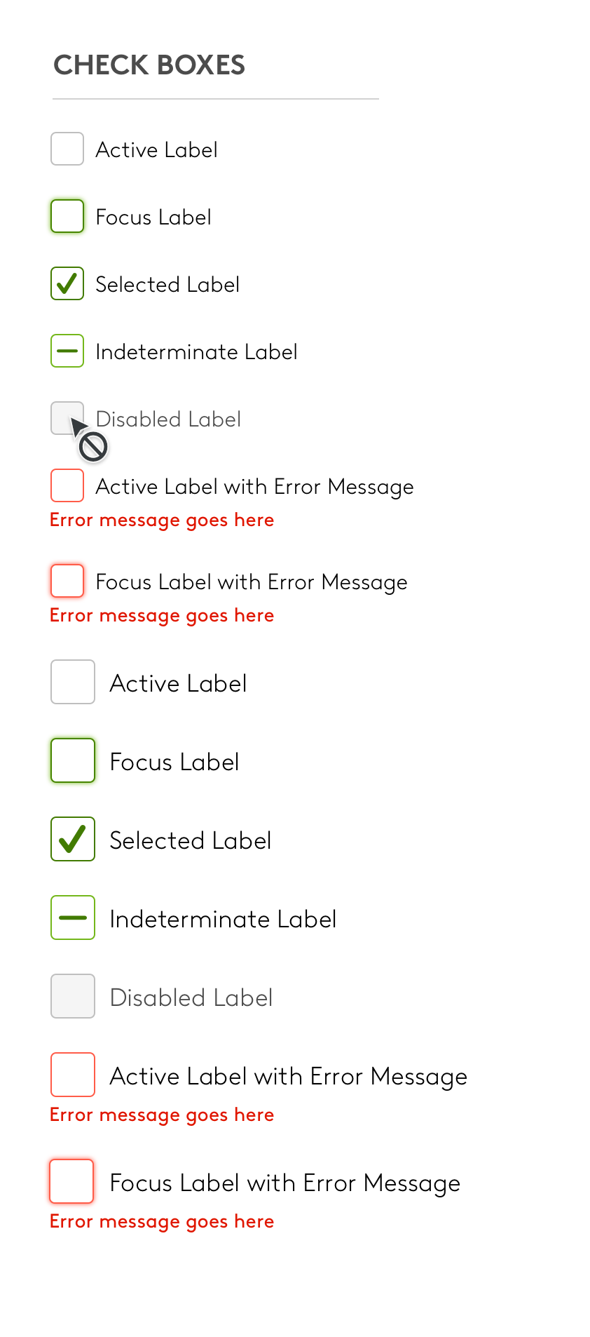
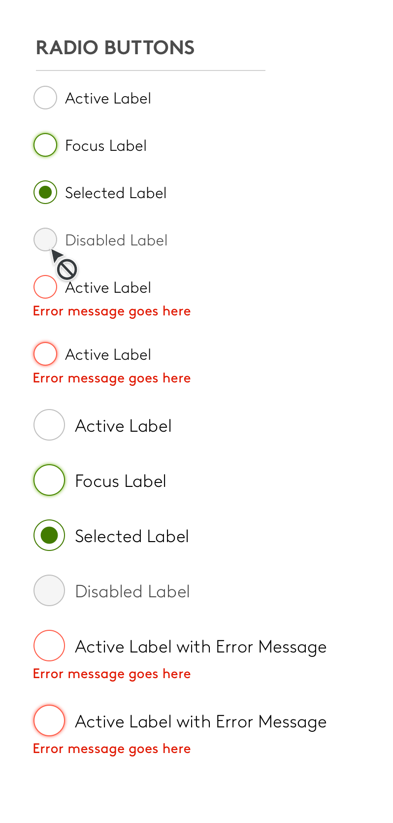
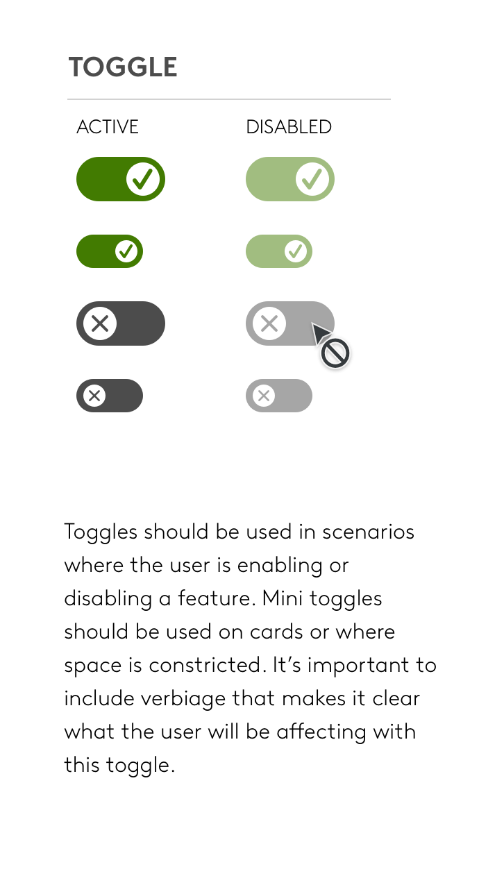
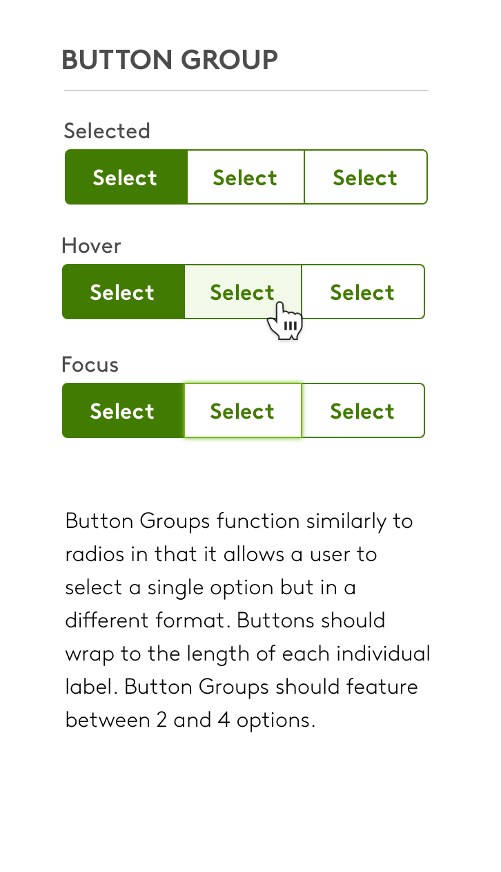
The variety of form fields needed for Apartments.com is quite vast, so it was essential to create an exhaustive library of every possible configuration and state, as well as ensuring they were usable for keyboard-only users, and defining a clear focus state for tabbing.
Selection UI
Icons and Illustrations
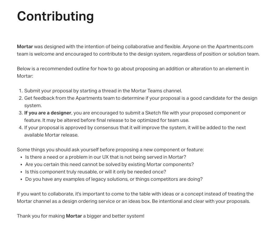
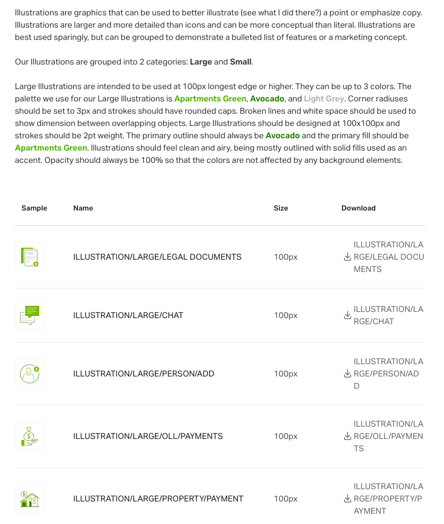
In building Mortar, I wanted to make sure to set it up for future growth and success. In my documentation, I provide guidance on how to contribute to the system while also maintaining a uniform style, making it impossible to tell one designer’s contribution from another.
Icons: After
Icons: Before
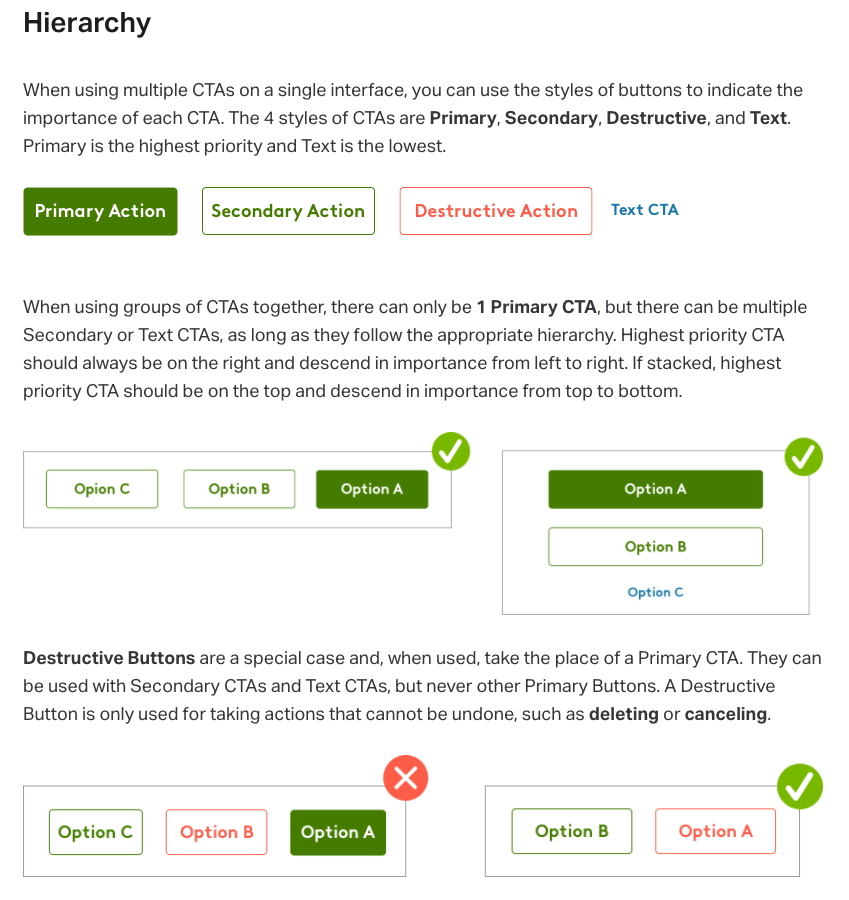
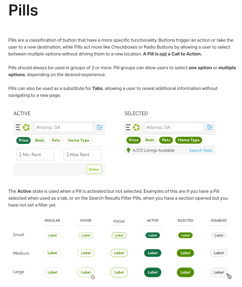
Buttons and Pills
Before ADA Compliance
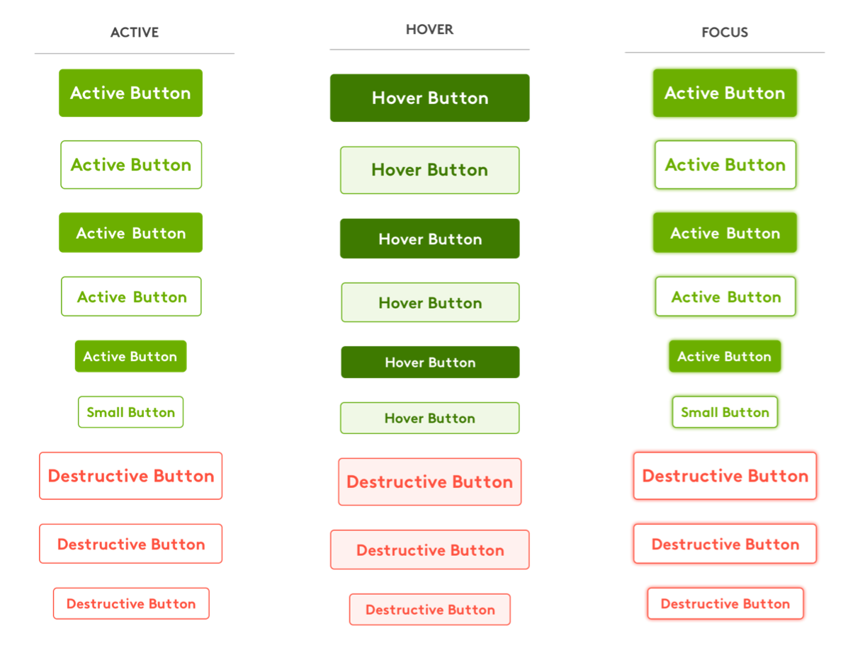
After ADA Compliance
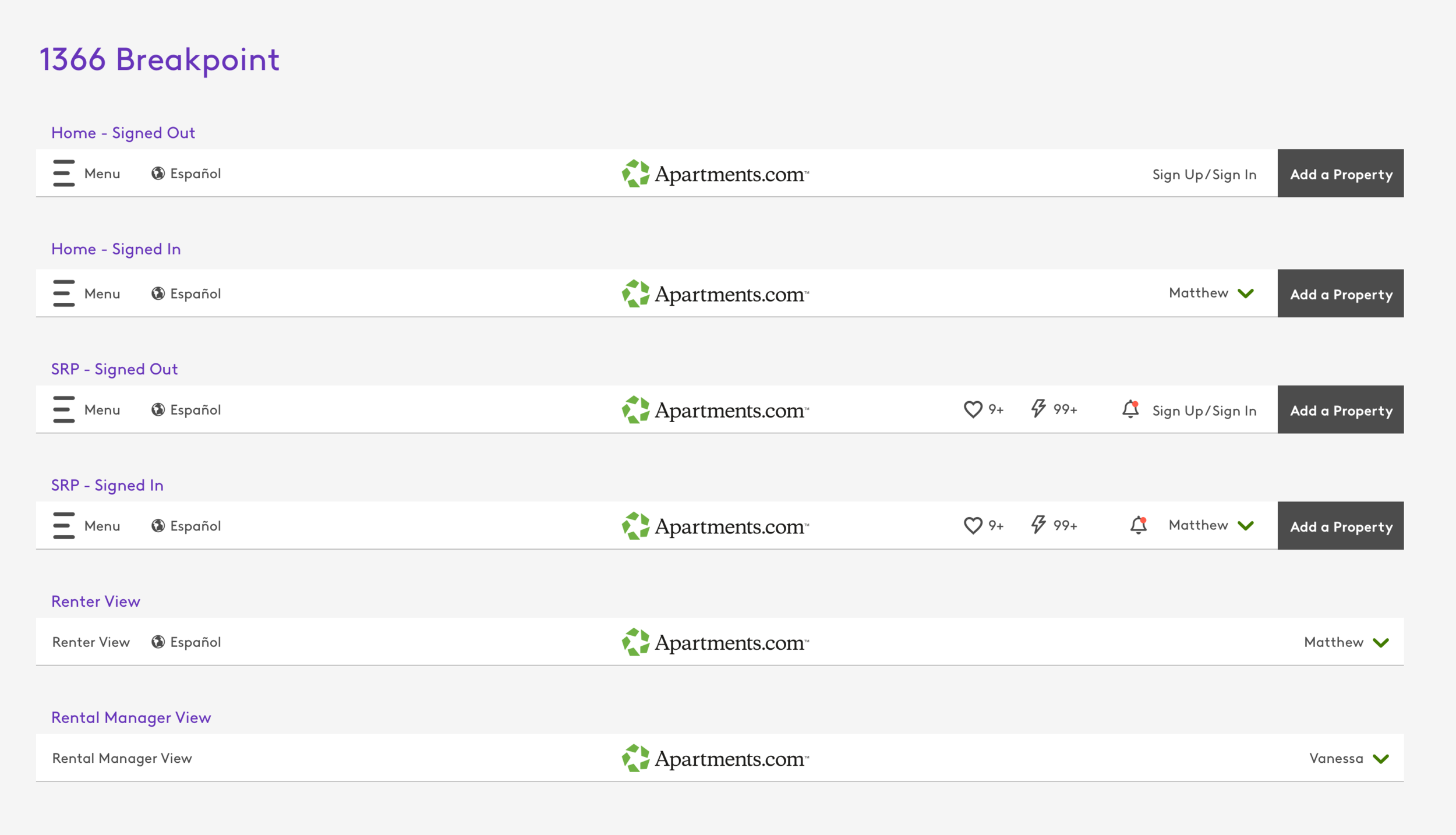
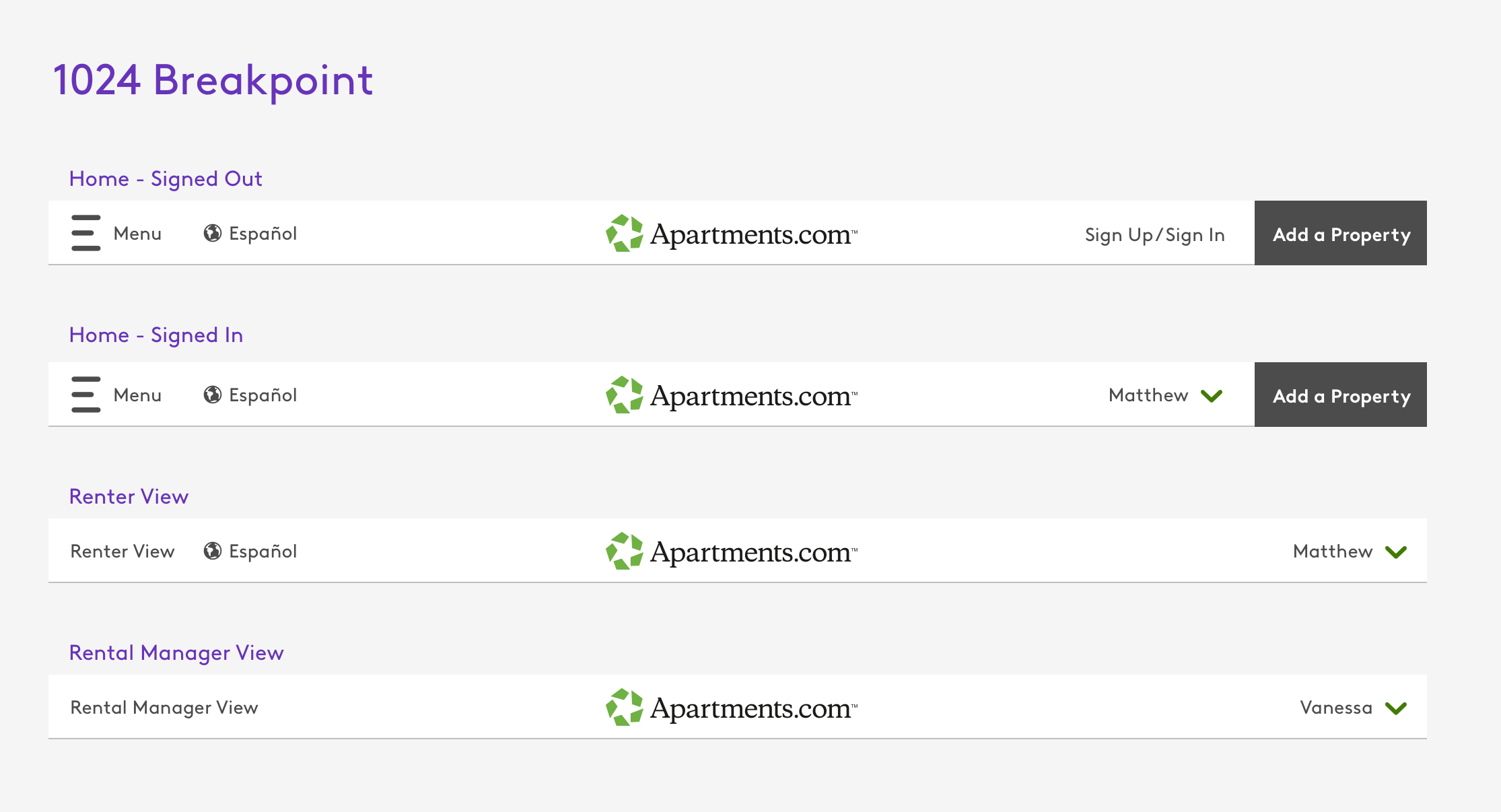
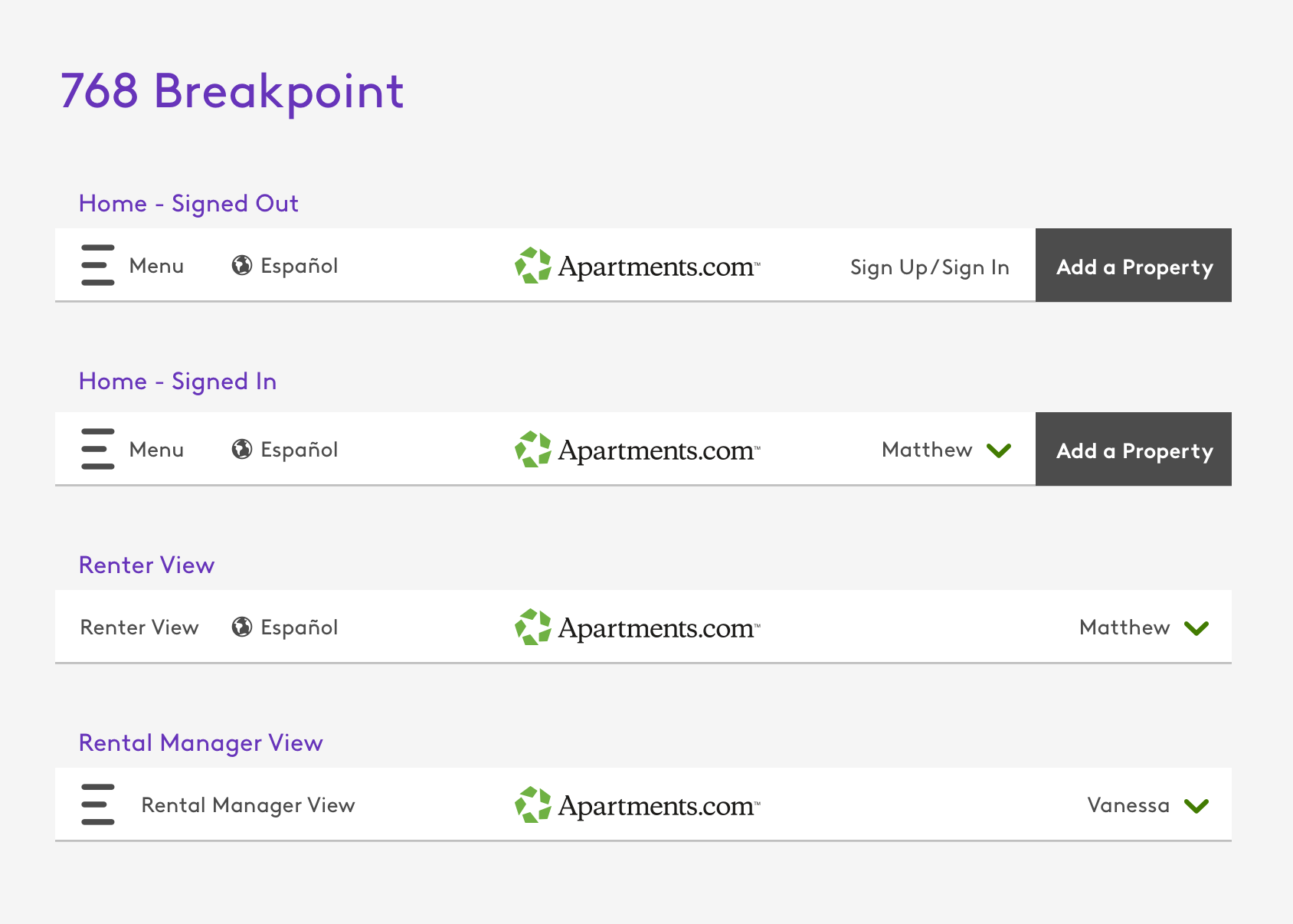
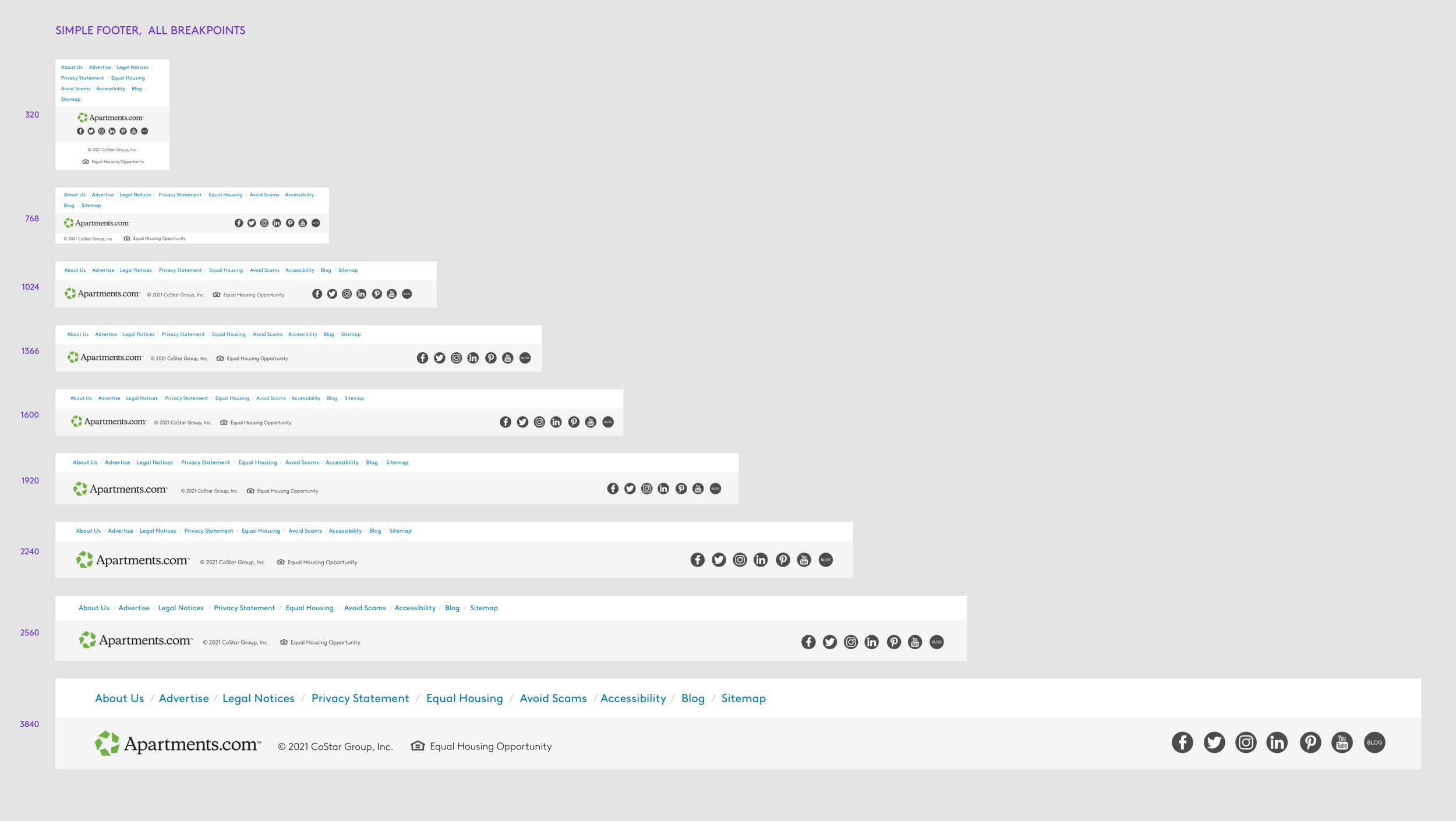
Universal Headers & Footers
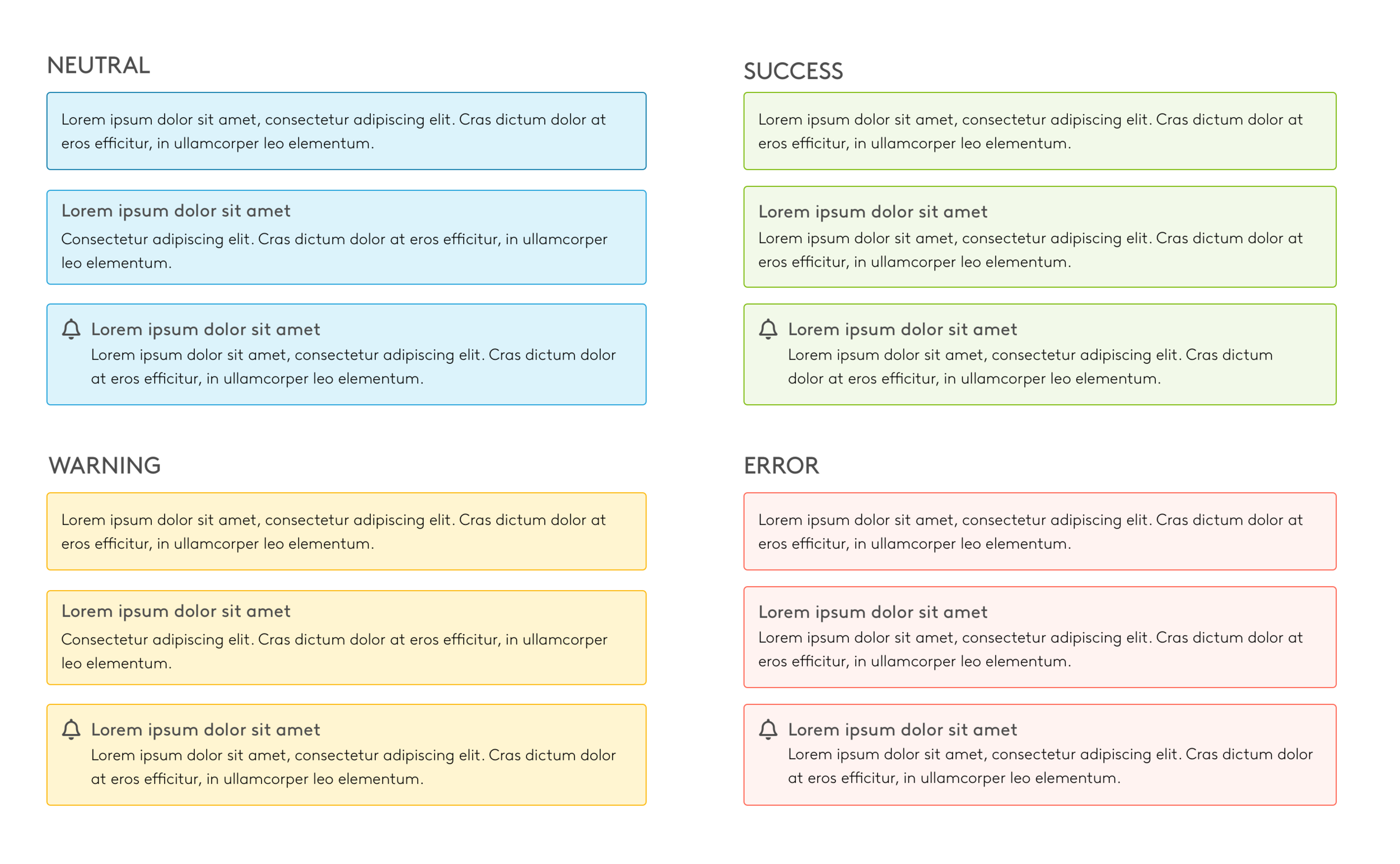
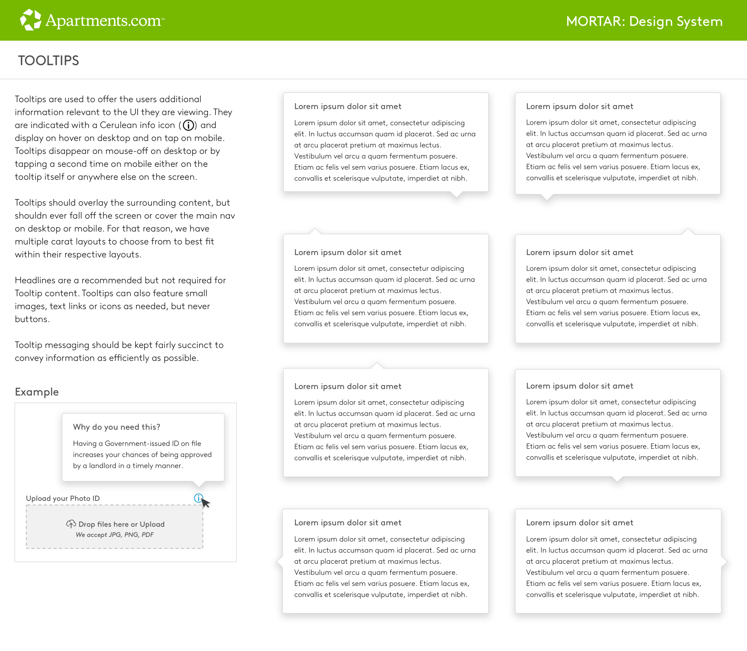
Messaging and Tooltips